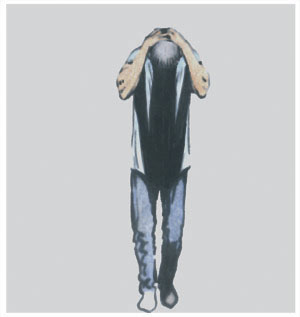
 THIS SHOT from page 22 of KB #2 (page 71 in collected edition) is a good pose that I'm pleased with of someone who's just discovered something they're unhappy about. I'm pleased with the background colour, too; but that happened by mistake. When I scan in the colour-pencilled b&w printout which forms the basis of the final page, it's sometimes at a low contrast setting. This setting greys the whites that surround the frames as well as those in the frames, of course. When I came to bleach out the greys around the frames, as I always do as the final stage of page-making, I'd forgotten that I'd left the last frame on the page open, and so the figure within it was in a background of grey. However, it looked so good to me that I left it just the way it was and followed it through as the background for the next frame on page 23. Sometimes accidents can be fortunate...
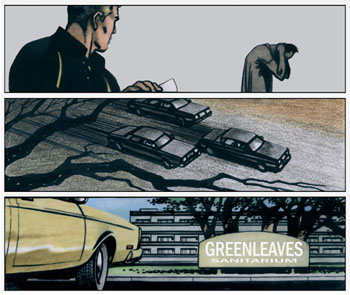 THE TOP three frames from page 23 of #2 I'm pleased with as a sequence of good cuts that take us swiftly from one place to another, but, like a lot of the frames I draw, which carry only the needed essence of the moment, I often wish there was a way to add to that essence without killing pace. For example, in a film of the same moment in frame two, the branches in the foreground could be shaking violently in a gale for a few seconds before the cars appear and race across the frame, then a cut to the shot at the sanitarium, where the weather is obviously calmer, and the clutch of trees beyond the sign are still in a breeze-less air, and then Candy's car will slowly roll into the frame and halt for a moment before it drives on towards the building.
Part of the art of strips is to make the most of the material we have, like tailors with half a roll of cloth instead of what we'd prefer. The skill lies in still being able to make a good suit.
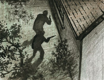 THIS is the full drawing of the gunmen shown on the monitor screen on page 28 of #2 as they approach the shore house. It was easier to draw this straight, then scan it in and simply use the computer to distort it to the correct perspective than to try to draw the scene directly onto the screen in a suitably distorted manner.
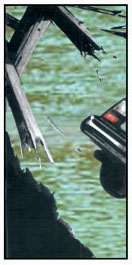 THERE ARE a number of readers of comic books who dislike the use of computer effects in strips. I had no intention of using them when I began to work on KB, but I found that the availability of 'special effects' as an enhancement was an opportunity I had no good reason to resist. In this frame from KB #2, page 30, for instance, the use of a capture of a photo for the river background gives a 3-D effect which emphasises the distance between the foreground and background, and also the difference between the world of water that the car is going to be plunged into, and the solid reliable world of earth and solidity it is being catapulted from.
Like all effects that can be used in art and storytelling—from Zip-a-tone to airbrushing and beyond—they work best when not over-used.
 I LIKE Jean-Pierre Melville's films, and though I didn't plan this frame from KB #2, page 36, to be redolent of his work, I was very pleased to hear from my publisher and editor, Jerome Martineau, that, 'Got the pages this morning. Love that panel through the stairway. And the whole scene so stylishly violent. Reminds me of Melville's Samourai.'
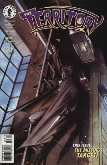 THIS IS the cover of issue 3 of The Territory, which I worked on with Jamie Delano for Dark Horse Comics in the US, and which I can only describe as a surreal journey through the fantastic worlds of pulp fiction. (I suggested DH use that line on the cover of a new edition, but they thought better of it...) The subject matter of each issue of the series centred around a different genre of those '40s magazines that became such a massive part of US culture at the time, and #3 was styled towards the genre of detective books like Black Mask. The whole series has been collected in hardback now—though, unfortunately, there are no plans for it to be translated into French.
